Easily Export ArcGIS Attribute Table to CSV


For many ArcGIS users, exporting an attribute table to a .csv file or excel format file is a common part of their workflow. Unfortunately, exporting to either of these formats directly from the attribute table has never been a core functionality of ArcGIS. To overcome this you typically have had two choices: write a script using third-party libraries or use an ArcToolbox tool such as the Export Feature Attributes to ASCII Tool or the Table to Excel conversion tool. But with each of these, you have to open special tools or go through multiple steps to convert.

However, there is a little shortcut you can take to quickly export your data to .csv right from the attribute table.

  • From the table, click Export.
  • Under “Output Table” browse to the folder you want to put your .csv file in, save type as .txt and enter a name for your output making sure to leave off the ‘.txt’ from the end of the name.

If the ‘.txt’ extension is present in the name the tool will output a normal text file of your data. If, however, your name does not include the ‘.txt’ extension or if you specify .csv, then your output will be a .csv file by default.


Can I export directly to a .xlsx format?

There’s another handy little trick for quickly getting ArcGIS attribute table data into any Microsoft Excel data format.

    1. With your attribute table still open, click on the Table Options drop-down in the upper left corner of the table and click “Select All”.
    2. Alternatively, you can select only the rows you want to export by holding your Ctrl button while clicking the leftmost, gray box by each desired row. You can also use the Select By Attributes button at the top of the table or select features (and their corresponding table records) from the map itself. The point is, select some records to export.
    3. Now right click on any of the leftmost, gray box of any record in the table and choose “Copy Selected”.
    4. With an Excel spreadsheet already open, right-click in the uppermost left cell and click “paste”. All of your records will be pasted to the worksheet.
    5. Save your worksheet as a .xlsx file (or any file extension that Excel provides for saving) and you’re done.

It takes longer to explain the above method than it does to put it into practice. After you do it once or twice it will be very quick.


4 Essential Maps to Have in an Emergency

Essential Maps for Emergencies

September is National Emergency Preparedness month. Every year throughout the United States there are fires, floods, storms, earthquakes, industrial accidents and even explosions. Sometimes these situations are contained to a small locality where they are easily managed. Other times, emergencies cover large geographic areas and impact the lives of thousands of people. Maps, imagery and GIS have become increasingly important in preparation for and management of emergency situations at federal, state and local levels.

But geospatial tools in an emergency are not just for organizations like FEMA and public safety departments. Individuals have access today to numerous map resources and they could be using them as insurance in the event that a natural or man made disaster should strike in their area. Below are four maps that could give you the upper hand in such a situation.

Home Floor Plan

Every home needs an evacuation plan. A simple pencil sketch of your house will do as you really just need to show the walls and where doors are located. If you want to get more detailed you could use an online floor plan creator like Autodesk Homestyler. Homestyler lets you build detailed, multi-level, 3D floor plans of your home’s interior.

Current Printed Street Map

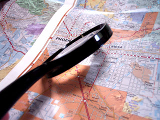
Google Maps are great for finding the shortest distance by road between locations. Along with other mapping applications like Bing Maps and MapQuest, Google Maps are a good first choice for routing yourself or others to safety. However, you always have to remember that in an emergency situation, Internet and/or cell reception could be disrupted. For this reason, among others, having a printed street map of the city you live in and the surrounding area is a good idea.
Street maps can often be purchased through organizations like AAA or in many gas stations located near the entrances to your city. The local chamber of commerce or visitor center often has maps for free or a low price or they can give you further advice on where to go to get a map. It is true that it is getting harder and harder to find good printed paper maps these days but they are still out there.

Safety Map

Maps are great if you know where you want to go. But in an emergency, unless you have a destination in mind of where you can find help or can meet up with loved ones, a map just shows you many ways to nowhere. At Safety-maps.orgyou can take care of the problem.
            Safety Maps is a free online tool that helps you plan for this situation. You can use it to choose a safe meeting place, print a customized map that specifies where it is, and share this map with your loved ones.
Safety-maps.org is a great site that is simple to use but serves a great purpose. Making a safety map is extremely easy. You just search for the area you live in (I used a zip code), position a green cross hair on the place designated for meeting and type a message or directions. Then you create your map and print it. You can fold several copies of the map for different people in your family so each will have one no matter where they are or what the situation.

US Road Map

Having a major roads map (or a US road atlas) can help you relocate once you are out of your local area if you need to evacuate quickly. A national level map is also handy for determining the location of disasters outside of your area. Rand McNally is one of the best known makers of quality road atlases.
There you go, four maps that could mean the difference in surviving an emergency situation. Are you prepared? Are there any you would add?

Could GIS be Killing You?

If you are a GIS professional there is a good possibility that you are slowly shaving time off your lifespan. What is this malady you might ask, and can it be prevented by moving to open source? If only it were that simple.
Several studies have shown that sitting for long periods of time can increase a person’s chances of dying from a heart attack by more than 50%. That is a scary fact that should get you thinking about what you can do to prevent it. Here are a couple of things you can do right now to reduce the risks associated with a sedentary job:
Sitting Kills
  1. Stand up! At least try to as much as possible. While the effects of sitting can be cumulative, interrupting your sitting periods can be beneficial.
  2. Use a standing desk. If you are in a work environment that will permit it, standing to do your work can make you feel better, make you burn more calories and of course and take care of the “sitting is bad” for you problem. If the cost of a standing desk is not something your employer will consider, you can always raise your monitors and keyboard with books or other objects.
  3. If you’re stuck using a regular desk you can always use a DeskCycle under the desk. This will keep your legs moving and blood circulating. Your rate of calorie burning will increase as well.
  4. Sit on an exercise ball. They are great for strengthening the lower back and you can always fall back into a couple of sit-ups when the fancy strikes.
  5. Collect GIS field data. If GPS data collection is part of your organization’s workflow, see if you can add that into your schedule a couple of times a week. You will be moving, burning calories and staying healthy.
  6. Exercise at your desk. Keeping your body in motion throughout the day goes a long way to keeping you healthy.
The lesson to take away from this is to keep moving. Regardless of you office situation there are probably things you can do to put a little motion into your day.

AFCEA Tracks Geospatial Intelligence

The Armed Forces Communications and Electronics Association (AFCEA) is a non-profit organization dedicated to serving military, government, academia and private industry. The association’s name centers on communications and electronics but under this broad umbrella are many varied disciplines and professional fields represented.

One such field is information systems technology. The April 2012 issue of SIGNAL, AFCEA’s monthly news magazine takes a closer look at geospatial information systems and their impact on today’s intelligence gathering efforts. While the articles in the current issue focus on the use of GIS for military intelligence gathering, they are useful for GIS users in all GIS communities. Developments, technologies and trends that begin at a national level often morph into public oriented applications that benefit downstream users. You can read the current issue of SIGNAL online and discover the other free tools AFCEA offers of their we site like their blog and e-newsletter.

Membership in AFCEA was once the privilege only of members of the military. Today, anyone with an interest in technology can join and take advantage of benefits like networking opportunities, educational discounts and product discounts through Dell and HP.

I have been a member of AFCEA for over four years now and consider it a top notch professional organization. Check it out and let me know what you think.

When GIS Becomes a Chore

River in Colorado

I just got back from a week-long trip to one of the last corners of Colorado without smoke filling the air. It was a great time of rock hunting, gold panning, hiking and just spending time with family.

In a typical work-week I will be on the computer for around eleven hours a day, however, throughout the entire week in Colorado I never went on a computer. On the drive back home the realization of how much I did not want to go back to it hit me.
It’s not that GIS work or following blogs and social media are not enjoyable activities because they are. The mix of logical problem solving through analysis and the creativity of cartography are hard to beat in any career field. I enjoy designing useful tools and providing engaging and helpful products for my employer. I also have a good time writing RyanRandom.com and keeping up with other blogs and Twitter.
The problem is that my job and online activites at home have become either boring and routine or overly time consuming. It is easy to fall into the routine of data maintenance at the day job which can make it seem boring or monotonous. Of course there really is data to maintain but my workplace is an environment that encourages innovation and learning. I need to capitalize on this.
When I get home I feel the need to throw myself into extra online activities (perhaps to compensate for my lack of interest at the office?). But what I usually end up doing is reading blogs more than writing them or just lurking places instead of being productive. When I do this I am wasting time that could be spent better elsewhere like with my family, learning a new skill or even getting enough rest.
So what can be done about a situation like this? I came up with the two lists below to help. The first list of five actions will be applied to my work situation. The second list of five actions are things that can be done at home to still be productive without being destructive.

On the Job:

  1. Find new angles to attack problems and try to incorporate new tools that can accomplish the task in a different way. There is no reason to be bored doing what I am doing even if some of my tasks are repetitive.
  2. Improve my cartography skills. No matter how effective your maps seem today, there is always room for improvement. There is a ton of great advice out there on improving cartography skill like GIS Cartography: A Guide to Effective Map Design by Gretchen Peterson.
  3. Start scripting and automating more with Python. Also, learn more programming languages that could make working easier and more fun.
  4. Participate more in the GIS community to gain insight and help from others.
  5. Utilize blogs and Twitter to solve more technical problems rather than stewing over them longer.

At Home:

  1. Put God and family first when I get home. The kids will only be the age they are now, right now. Spending time doing what matters most should be my priority; if it’s online, it does not matter most.
  2. Spend less time on the computer but accomplish more. Become more productive.
  3. Make goals before sitting down to work and get off the computer when done.
  4. Move slower and stop trying to do so much. You do not need to wear your body and mind out to be productive.
  5. Get more sleep and exercise.
Does anybody else suffer from work boredom and self-overwork at home? What are some of your solutions? I would love to hear them.

Why Globes Aren’t Popular But Should Be

Globes are fascinating geographic instruments. They give a proportionately accurate view of the earth allowing for a better understanding of the relationships between various land areas and water bodies.
While paper maps and on-screen digital maps can give much more detail about large scale areas of the earth, the globe gives an accurate representation of earth’s features at a very small scale. Nevertheless one rarely sees globes anymore today. Few classrooms have one to teach students about the planet they live on. Fewer still are found in homes.
There are several reasons for the disappearance of the globe from society.

Quality globes are expensive

You can pick up a fairly cheap one at WalMart or Target but to get a high quality one that will last many years and the annotation can be read clearly you might have to spend up to $150 or more.

Globes are difficult to update

World data can change. Place names and spellings do not stay the same forever. Updating a globe basically means buying a new one so the expense and effort do not always seem worth it. Some globe manufacturers offer a globe update program. These programs offer a discount if the globe you bought from them is within a certain warranty period.

Digital globes are prevalent

Google Earth can give a more versatile 3D model of the earth’s surface by serving updated data and more of it. Google Earth is free and it does not take up any room.
The question remains, are there any reasons why someone would want to still own a globe? I contend there are at least four good reasons for buying one:
1.       A tactile 3D earth is one of the best ways for someone to learn about the relationships between places on the earth. It can be difficult to conceptualize what is meant by terms like “the other side of the earth” or “the land down under”. On a globe it becomes obvious. Seeing a spherical object rotating on an axis is still a most effective learning tool.
2.       They look cool in an office or a library. Nothing says geography professional like a quality globe.
3.       Globes make it easier to understand the concepts of latitude and longitude. Lines of latitude and longitude are measured in angular degrees from the center of the earth. Understanding this is not easy on a flat paper map.
4.       Globes add a certain style to rooms. You can choose decorative globes that look vintage, modern, dark, light, large, small, nautical themed or covered with animal pictures for children. You can even find globes of the moon or ones that show constellations and glow in the dark.
Whatever your reason for buying a globe rest assured it will get used. There is just something about the things that make you want to touch them, spin them and admire them. Although they might not be the first thing one thinks about when geography is mentioned these days, globes are still a great and valuable tool for everyone.

National Adjustment of 2011 – What Does it Mean For You?

National Geodetic Survey

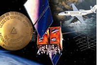
The National Geodetic Survey (NGS) has been working for over a year now to adjust the NAD83 datum with what is called the National Adjustment of 2011 or NA2011. How much adjustment are we talking about here? If you guessed only about two centimeters, you would be right on the money.

So why are the NGS geodesists working so hard for such a small change and is it worth the potential problems it could cause users of NAD83? It turns out the reasoning behind the adjustments are sound and will be a benefit to the future of surveying and GPS usage.

The main advantage of the NA2011 is that it will tie together and align passive(in ground monuments) and active(CORS) control stations throughout the United States. There are roughly 80,000 passive control marks that will be effectively brought into the modern system.

It is important to remember that this is not a new datum (that will be coming in about ten years); It is an adjustment of the current NAD83 datum. However, there will be a new geoid model (Geoid12) as a result of the changes. Of course this new hybrid geoid will not be developed until after the NA2011.

Fun stuff! The projected completion date for the adjustment is June 30, 2012 so it could be just around the corner. Of course they had originally planned on completing it before the end of 2011 but maybe this time they will be on schedule. If you want more information about the NA2011 you can visit the NGS web site.

Another Tool in the Box: National Geographic’s MapMaker Interactive

I finally got around to playing with National Geographic’s MapMaker Interactive application on the organization’s education site. As a GIS analyst with two young boys I am always interested in tools that can help teach them about geography or GIS. The MapMaker tool helps teach both of these.

The interface is built on the ArcGIS framework using the ArcGIS API for flex. It features eight base maps to choose from including National Geographic view, satellite view, streets view and oceans view. There are also six themes (with related sub-themes) such as water, land, climate and population, that help users turn out handsome looking maps quickly.

National Geographic MapMaker Interactive

The drawing tools are very user-friendly and include only six basic tools. In addition to these, there is a “markers” tab that provides 30 different symbols representing vegetation, structures and events. You choose between three different marker sizes then drag and drop the marker where you want the point to be located.

Other than looking at the prefabricated themes or measuring distances between locations there is really no analysis that can be done with this map. However, the tool is called MapMaker, not MapAnalyzer, and is geared toward kids so one really cannot complain.

While kids might be the target audience of the MapMaker, its simplicity lends itself to be used by adults who are not GIS savvy but might want to make a quick and authoritative looking map for a manager or client.

The National Geographic education site is still in Beta at the time of this post so there are still a few issues with the tools acting buggy. It would also be great to see a PDF export option and a way to retain measurement annotation as a permanent part fo the map. Those are just minor complaints though and the functionality may well change as the web site goes through and comes out of Beta.

Overall this is a great tool to use for basic mapping or teaching about geography and geographic information systems. Head over to the site and give it a try. You might find that you have another free tool that you can use to make a quick one-off presentation map or you can recommend it to a non-GIS user who wants to play cartographer.

Teaching Geography is Fundamental Act is Misguided

There are nine core academic subjects in the No Child Left Behind Act. Of the nine, only geography doesn’t have its own federal funding stream. Since 2008, geography advocates have petitioned the federal government for just such a stream, in part by supporting what is called the Teaching Geography is Fundamental Act. There is a reason why this act has been introduced and subsequently died in two previous congresses – It is not good legislation.

Out of 15 potential uses for the funds identified within the Act, only a few reference clear, actionable uses. The rest consist of “promoting”, “strengthening”, “encouraging” or “supporting” vague notions including “academic standards”, applying GIS to teaching, and “research”. What does that actually mean?

The language of the Act creates a grant of $75,000,000 spread over five years but fails to designate concrete uses of that money. The Act basically throws money at an issue expecting the issue to then resolve itself. Of course, this should surprise no one since the government’s response to most problems is to appropriate funds. Educators should know better than to see this as a solution but it becomes difficult to see beyond the potential of receiving money, regardless of its dubious origins.

Activists could better spend their time trying to get rid of legislation like the No Child Left Behind Act so we can stop teaching based on federal mandates and standardized tests and go back to student based teaching.

What Makes GIS Interesting?

Geospatial technologies do not exist for their own sake. The real power of geospatial technology is in its ability to solve problems in other disciplines. GIS is not a tool that is applied to the GIS industry. Rather, it is a tool to be applied to geology, engineering, aviation, logistics, gardening, personal navigation, intelligence, real estate… the list goes on and on.

It is rare that an industry today is not touched by some form of location based technology or GIS. It is this interplay between geospatial technology and the multitude ways of consuming and utilizing it that makes it so exciting.