Gardengraphic Information Systems – How Maps and Data Help Gardens Succeed

Spring will soon be upon us and gardeners of all stripes will begin pruning landscapes and planting vegetables. The National Gardening Association reports that gardeners spent nearly $3 billion in 2011 on food gardening alone. With this much money being spent (not to mention the amount of time) to grow produce or create beautiful landscapes, it stands to reason that most gardeners would appreciate any advantage they could get to make their efforts fruitful.
Trowel
Modern mapping and GIS is just such an advantage. With a computer and an internet connection, today’s gardener has at his fingertips a wealth of information to help make decisions about things like plant selection, date of last frost and possible blight. The following are just a few of the sites a tech savvy gardener might consider consulting before sliding his spade through the topsoil. Taken together they form what I like to call my Gardengraphic Information System.
  • The USDA Hardiness Zone Map is probably the best known of the maps listed here. It is used by gardeners and farmers nation-wide as a general guide for selecting plants that will thrive in a given location. The map is divided into zones that depict average annual minimum winter temperatures. When you go to purchase plants or seed packets you will often see what zone the plant is recommended for. The 2012 hardiness zone map is available for download but is now also available as an interactive map that can be searched by zip code.
  • While knowing the hardiness zone that you live in is important, it can be equally important to determine when frost might begin appearing in the garden in the Fall. The Better Homes and Gardens First Autumn Frost Map might help do just that. While the map is not very precise, it can give a general window for the gardener to keep watch on the temperature.
  • Another USDA map useful to the gardener is the soil survey map. The map provides soil data and information for more than 95% of the counties in the United States. The soil in an individual’s home garden will likely be slightly different than what is found in the map but the survey will describe the major soil types for a given area. This can be extremely helpful to the gardener who is trying to decide how to best amend his soil for the type of planting he intends to do.
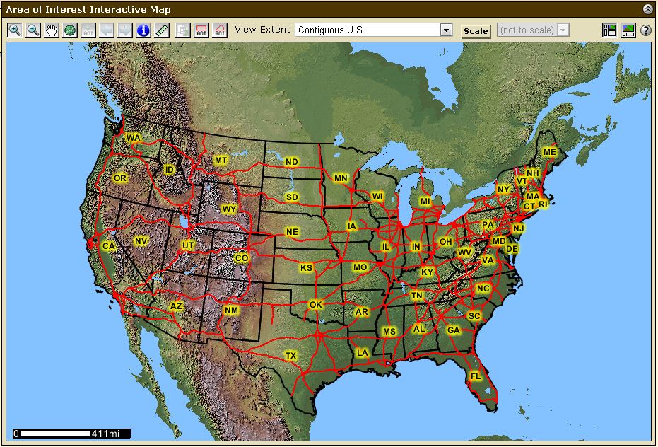
USDA Soil Survey
USDA Soil Survey
  • USAblight is “a national project on Late Blight of tomatoes and potato in the United States”.  Tomatoes are one of the most popular vegetables grown in US gardens. It is easy to see why this disease is an important one to track. Late blight was the cause of the Irish potato famine in 1845. USAblight uses a Google map to show reported incidences of Late Blight. The map can be checked to track outbreaks or to report one.
  • Just to emphasize the importance of Late Blight, uspest.org has designed their own Google powered blight risk map. This one displays not only reported outbreaks but risk conditions throughout the US. Other maps available for use on this site include Daily degree-day accumulation modeling maps and a  Page with Weather, Plant Disease Risk and Degree-Day/Phenology models.
  • Again the USDA provides a useful application that the gardener can leverage for his own use. The PLANTS database provides information about a variety of plants found throughout the United States. The most significant category for the knowledgeable gardener might be on the topic of cover crops. Clicking on this link will bring up a list of cover crops. The user can click on the plant’s name and be taken to an interactive map showing US states and counties. Clicking on your state will show whether that cover crop is native or naturalized. Much more data than this is also presented about your selected plant in a non-spatial format. This database also has fact sheets, guides, culturally significant and alternative crops data and information about invasive and noxious weeds.

Gardening is one of the most popular hobbies in the United States. It is also one that can directly benefit from GIS technology. If you have a green thumb I highly recommend spending a few minutes checking out some of the above resources. If you know of any other sites that would help gardeners be more efficient or more productive, leave a comment below and let me know what they are.

Update 2/25/2012:

The good folks at Hampton Hollow Farm ( @HHollowFarm ) pointed out that they use AgSquared, an online farm planning and management software package, to run their organic vegetable farm in Nova Scotia. According to the AgSquared website the software allows you to create a “Farm Plan” which includes an interactive field layout mapping tool. You can also manage your farm’s schedule, keep year to year records, plan harvests and generate reports. The software looks powerful and was designed for small farms but even the home gardener could benefit from its use. The software’s regular price is only $60 per year making it affordable even for hobbyists.

Are Paper Maps Dying?


With all of the visualization technology we have available, why do we still find it
necessary to print maps? With desktops, laptops, smartphones and tablets, it would seem that paper map production should be all but extinct. This does not seem to be the case though.

 
Technology has broadened our access to maps we previously could not obtain and created new mapping products that we might not have even considered before the popularization of personal GIS.
 

Likewise, when Kindles and later Nooks first started appearing it was said they would herald the demise of the printed and bound book. 

We have certainly seen plenty of bookstores go out of business over the last few years but the last time I was in Barnes and Noble there were plenty of books still to be found.

 
Amazon Kindle


So why do we continue to print what we can simply view instantly and continuously? Here are a few reasons why paper maps are not going away any time soon:

 
  • Paper maps do not freeze up or run out of batteries. A GeoPDF on your tablet is a great tool. It becomes somewhat less effective when your tablet is not working properly.
  • Cost of new devices can be an issue. This is becoming less a factor as technology becomes cheaper and plotters, ink and paper prices stay the same or rise. Technology is still a new investment for many organizations, though.
  • Paper maps give the big picture. There is only so much of a map that one can fit on a computer screen without having to reduce its on-screen size. It is easier for the brain to process a map of fixed size than to readjust its spatial understanding with a zoom.
  • Physical maps are easy to share. A paper map can be passed between several people without worrying about computer access, having the right program installed, formatting and compatibility.
  • Humans still desire tangible and tactile things. A paper map has an aesthetic that appeals to the human need for real things.
Let me know what you think about the future of map media.


Free GIS Data – Ten Favorite Sources

GIS data is everywhere. Some you have to pay for but much of it is free and widely available like at the sites below. Doing a search for free GIS data will yield some of the data sources I mention here. Locating other sources just takes a little digging. Almost all of these sites are from the U.S. government so the datasets are largely nationwide.
Map of United States
  1. GIS Data Depot – Large data holding in various formats from various sources.
  2. USDA Geospatial Data Gateway – Environmental and natural resources Data including imagery
  3. BLM Internet Sites – List of BLM sites hosting a variety of public lands data. Some state specific data
  4. U.S. Department of Transportation – Transportation data sets and links to other GIS data sources
  5. National Park Service – Interactive data search map. Data provided in .csv or .xlsx formats
  6. EPA – Environmental Dataset Gateway
  7. USGS – High res orthoimagery downloads from the Seamless Data Warehouse
  8. FEMA – Emergency and disaster datasets in formats including KMZ, shp, and geoRSS
  9. Census – TIGER products including data up to 2011
  10. NOAA Vents Program – Great resource for Bathymetric GIS datasets related to hydrothermal vents
Other great sources for free GIS data include city, county and state websites. Pages likely to include useful geospatial data include departments of transportation, departments of wildlife and county assessor’s offices.
Many government entities centralize their GIS data repositories. Others will distribute the data to the various departments they pertain to. With a little bit of site searching you should come up with whatever you are looking for.

Getting Your Bearing In A Digital World

There is no doubt we live in a geospatial age. We are inundated with location based data wherever we turn. While some mapping applications like OpenStreetMap appeal to targeted users, others such as Google maps, Bing Maps, Yahoo Maps and MapQuest are main stream and are accessed by millions of users every day. But are people any more spatially aware of surroundings even with these tools and GPS units in every car and smartphone?
North
North is up there
I run into people all the time who can follow a GPS that says turn right on Smith street but couldn’t tell you what directions Smith street runs to save their lives. It could be said that we are actually losing our directional abilities. Google maps doesn’t even give bearing throughout your route. There is only one bearing at the beginning of the directions. The rest of your route is made up of “Left”, “Right”, and “Take Exit…”
Okay, so what? If we have the tools to get us from point A to point B, why should we care if our driving map has a compass rose on it? Well, here are three reasons I think directional aptitude is still important:
  1. Mapping technology is unreliable. Online maps are only as good as the data human beings put into them.
  2. Data may not always be available. Even with mobile technology there are times when digital maps and directions will not be at your fingertips. Batteries die, charging cables are forgotten and phones are left behind on counters.
  3. Having your bearing is a safety issue. Knowing your location relative to another location can be a matter of safety. Emergency services can find you easier if they know you are north or south of a particular intersection.
Map meeting
So how can directionaly challenged individuals build back their sense of bearing? Here are three things that might help:
  1. The sun rises in the east and sets in the west. Knowing just this piece of information can help a person get their bearing for a good portion of the day. Face a rising sun and west is behind you , north is to your left and south is to your right. With practice, directional orientation will become second nature.
  2. In town, pay attention to N,S,E,W on street signs. That paired with increasing or decreasing block numbers will give you a direction.
  3. Get in the habit of using paper maps. You will remember street names and landmarks in relation to a map’s compass rose.
Modern computer mapping has revolutionized our world today. While the internet and geospatial technologies are indispensable in much of our daily lives they have also taken away some of our ability to think for ourselves. Fortunately it is not difficult to reclaim that lost territory.

Using Pinterest to Catalog Online Maps

Pinterest

What is Pinterest?Cartographers and GIS users are often visual by nature. Pinterest is a tool that allows the visually minded to capitalize on images posted throughout the web. In a nutshell, Pinterest allows a user to “pin” images, found on the web, to virtual pin boards. These pin boards are organized by topic and the images you save to them link back to the original page they were found on.

Pinterest geospatial pin boards
Here are a couple of my pin boards I use for geospatial images and maps


Pinterest is sometimes thought of as a social network for women interested in home décor or fashion or recipes. To be honest, I first head about the site from my wife who has a food blog. When I saw what you can do with the site, however, I knew I had found a great resource for organizing, saving, and enjoying maps found online. Of course I don’t use it only for maps. I use it to inventory anything of visual interest that I come across including food, clothing and various hobby interests. That, incidentally, is how the site got its name. Users pin their interests.
The social aspect of Pinterest comes with its follow and re-pin functions. This allows you to view images saved by others with similar interests. I have searched Pinterest and while there are a few maps here and there, the geospatial and cartographic communities have yet to really discover the site.
How to Use Pinterest
As of this blog post Pinterest is available as an invite only network. If you know someone who has an account you can get them to send you an email invite. Otherwise, you can use the Request an Invite button on the log in page.

Pinterest request invite button
You can request an invite at Pinterest.com


After receiving an invite and signing up for the site you will be prompted to install a “Pin It” button extension for your browser. When you are visiting a page with images on it, you can click the Pin It button which gives you the option of pinning some or all of the images found. You can add the images to any board in your Pinterest profile or create a new custom board right then. In addition to the image you are asked to provide a description of the pin.
Users are given several default boards when they sign up. These can be deleted or renamed and new boards can be created. This benefits the cartography connoisseur by providing a framework in which to categorize and link to maps found while perusing the web.
Conclusion
The goal of most social networking communities is to interact and converse on topics of interest. Pinterest is no different and is perfect for those of us with geospatial interests. I have only just begun to utilize the site and hope to see my virtual pin boards grow throughout the year. Let me know what you think of Pinterest as a tool for geospatial users. If you decide to join you can
Follow Me on Pinterest Button
Update:

The more I use Pinterest and engage with the community, the more geospatially oriented folks I find including  Big Map Blog who recently started following my pins.

The KidsRuby 1.0 Adventure

Today my seven-year-old son and I embarked on a mission to learn how to program with KidsRuby 1.0. Before ever hearing of KidsRuby my son had expressed interest in programming so he could create games.

I use Python on a regular basis and had considered using the language to teach programming basics. However, there are few resources specifically for teaching Python (or any language) to kids out there. Those resources that do exist for kids are not well developed. That is why I was very excited when I discovered KidsRuby through Twitter (@kidsruby).
The KidsRuby 1.0 environment seems like a great way to get started with the Ruby language. It includes a code editor, a help tab with Ruby lessons and an output area where you can interact with your code.
This was my first experience with the Ruby language so as I go through the tutorials with my son I will be learning too. So far I am encouraged that my son has put in several hours learning with KidsRuby and keeps asking to do more. I have to pull him off the laptop so he can take a rest. As we get further into our studies I will post updates on our progress.

Add Custom Color Ramps To ArcGIS From The ESRI Mapping Center

**This post references ESRI ArcGIS Desktop 10.0. While the steps listed might work in previous or future versions of ArcMap, it is not guaranteed. There is an updated version of this post here.**
 
When you have a continuous raster such as a DEM in ArcGIS, you will likely want to adjust its color ramp to better highlight elevation changes. The default color ramps suffice for a majority of situations, however, your choices are still limited. To expand your list you could create your own color ramp or you could import a new .style file containing ready-to-use color ramps and symbols.
 
The ESRI Mapping Center provides a set of color ramps to help further depict raster surfaces. The ramps are divided among four styles which are Hypsometry, Hillshades, Events and CartoEffects. Following are the steps you take to add the new color ramps:
 
 
  1. On the ArcGIS resources page of the Mapping Center choose the Styles tab and click on ColorRamps2.0 to start the download.
  2. After you download the file, unzip it. Inside you will find four .style files and a .txt file describing the styles.
  3. Copy the four .style files to C:\Program Files\ArcGIS\Desktop10.0\Styles.
  4. Open a map document.
  5. Click the customize dropdown and select Style Manager.
  6. On the right side of the Style Manager click on the Styles… button. In the Style References window that opens click Add Style to List….
  7. Navigate to C:\Program Files\ArcGIS\Desktop10.0\Styles where you placed the .style files and select the first one. You might have to repeat this step once for each style.
  8. After all of the styles are shown in the Style References list, make sure they are check marked and click the Set as Default List button.
  9. Click OK and you should see your styles on the left side of the Style Manager. Close the style manager. At this point you can go to the symbology tab of your Layer Properties for a given raster and select one of the new color ramps.
 
Tip: Right Click on the color ramp dropdown and uncheck Graphic View to see the text descriptions of the ramps.

GISnation.com, Social Networking for the Geospatial Community?

A new GIS centered web site called GISnation.com launched yesterday. According to the site’s mission statement its purpose is simply to promote “geospatial solutions” and provide a multi-use platform to showcasing GIS projects.
The site tries to pack a lot into its pages. It attempts to provide tools and services such as social networks, job boards, resource searches, news feeds, promotional challenges and project submission platforms. The social networking aspect itself is quite involved. There is a Facebook-like “wall” that you can post updates to, a blogging interface where you can create your own blog within the larger site, a file upload area, a photo gallery, a professional networking page where you can have a LinkedIn-like profile and a project collaboration area where you can work with others on a geospatial solution.
It will be interesting to see how the geospatial community reacts to a centralized site like this that combines multiple aspects of already established social media services in a GIS centered environment. As with any application that claims to be a social media platform, its value will be revealed by the users who engage with it. If the GIS user community has a need for what GISnation is attempting to provide, it could do well.
I will be interacting on the site in the coming days and will try to report my findings. Meanwhile, if you sign up for access to the site, leave a comment here and let me know what you think. Do you think it has a future?
Update: Apparently GISnation didn’t have much of a futre. The site doesn’t seem to be in existence any more. It’s probably just as well since ESRI already has established forums and GIS communities are already created on sites like Twitter, Facebook and Google Plus.

What is in Your Office Desk Drawer?

I took a look in the top drawer of my desk at work the other day. I’m not talking about the glance you give when you throw something in that you might need “someday”. I actually looked at what was in there. It was kind of scary what I had let accumulate. Here is a partial list of what I found:
  • Box of pushpins
  • Obsolete Autodesk, ESRI, and Trimble trial software and drivers from 3 years ago.
  • Short, flathead screwdriver
  • A Spaceghost Christmas ornament
  • Organic white tea bags (about 6 of them)
  • 12 inch ruler (I actually use this from time to time to measure margins, boxes, icons and other elements on printed maps)
  • 2009 statistical abstract of the United States
  • Four USB cables from unknown hardware purchases
  • Engineering ruler
  • Box of plastic forks
  • Bottle of instant Krazy Glue
  • More than eleven pens from geospatial conference vendors
  • Scissors
  • 12 volt power supply to something I probably threw away in 2010
  • Crossword puzzle book
  • Seven lip balm containers (Six were empty)
  • PS/2 to USB adapter
  • Sunscreen
  • Some flashy button thing from a conference
  • Various sizes of sticky note pad
Contents of my desk drawer
This was just the top drawer. I’m kind of afraid to get into the bottom two. It looks like I am going to have to do some winter cleaning pretty soon.

I am sure there are plenty of more interesting desk drawer content lists out there so leave a comment and let me know what’s in yours.

Social Media Speaks and the Government Listens

The idea of social media command centers is not a new one. The best known centers might be from Gatorade and Dell who each use theirs for brand monitoring. But businesses are not the only ones accessing large amounts of social media data. Carahsoft, a private government solutions company currently markets the InTTENSITY Social Media Command Center, by the InTTENSITYCorporation, to the US Government intelligence community. According to InTTENSITY, their web based SaaS product officially launched in September of 2011, has the capability to anticipate and measure events as they happen or even before they happen, based on social media monitoring.
It could be like a real life version of the TV show Person of Interest. With this software, upcoming events mentioned in the social media cloud could be monitored and even interrupted as they occur. If your tweets and updates happen to be tagged with a geospatial reference (address, city, lat/long) social activity could be pinpointed with precision.
Since much of social media is by definition public communication (as opposed to a private phone call or email) there doesn’t seem to be a barrier to a government entity watching what flows through Twitter to monitor actions, speech or ideas it doesn’t approve of, then affecting it in some way.
InTTENSITY claims its software is capable of tapping into the entire Twitter stream as well as Facebook and blog sites and can monitor in up to thirty-two languages. Is software like the InTTENSITY Command Center just TweetDeck on steroids? Is it an innocuous use of social media technology? Or does its potential as a social monitoring tool pose a threat to individual and community liberty?
I am not suggesting that our government is using or will use this software for anything other than monitoring real threats to the American people. However, as our government is further enabled to follow our daily personal lives, we the people must follow them even closer.